Seven lower thirds, two of them free
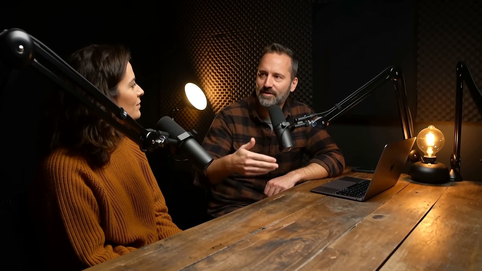
- Glide Lower Third: the name rises in letter by letter and an accent line sweeps underneath. Clean and neutral for interviews and talking heads, with an optional panel for bright footage.
- Pill Lower Third: pops open with a soft bounce, an accent dot and a colored title tag. Friendlier, for YouTube and podcasts.
- Glass Lower Third: a frosted pane that blurs and brightens the video behind it.
- Ink Lower Third: a liquid panel with a rippling edge that swells in and drains away.
- Speaker Lower Third: a serif name, a gold rule and a small-caps role, for pastors, hosts and panels.
- Key Verse Lower Third (free): a short verse or quote with its reference.
- Social Handle (free): an @ pill for handles and credits.
How auto-sizing works
In many lower thirds the box is a fixed shape with text on top. Type a longer name and it spills out the side, so you end up scaling the box by hand on every clip.
In these templates the panel measures the text and sizes itself to match, with padding around it. Change Sam Li to Alexandra Richardson and the panel grows, and the accent lines, tags and edges follow. The second line counts too: if the title is longer than the name, the panel sizes to the longer of the two.
It's all done with expressions inside the template, so there's nothing to set up. It also means a batch of names for a panel discussion takes minutes: duplicate the clip, change the name, move on.
How trimming works
Each template has a protected intro and outro, set with After Effects' Responsive Design time controls. When you trim or extend the clip in Premiere, the in and out animations keep their speed and only the hold in the middle changes. A three-second clip and a twelve-second clip animate the same way; one just stays up longer.
So you set the on-screen time by trimming, like any other clip. Four seconds is a sensible minimum for a name and title, and longer titles need longer holds. If you want the motion itself quicker or slower, use the Animation length control rather than speeding up the clip.
A workflow for lots of names
- Style one lower third: colors, position, and the panel on or off.
- Alt-drag (Option-drag on a Mac) to copy it along the timeline for each speaker.
- Change only the name and title on each copy. Every copy keeps its own text.
- Keep the styled original in a graphics sequence, so the next episode starts from the same look.
Pick one position and keep it for the whole video. Viewers learn where to look, and the edit looks deliberate. In an interview, show each person's name the first time they speak and again after a long gap, not every time they talk.
Legibility over real footage
- Title safe: keep text at least 5% in from the edges. Turn on Safe Margins in the Program Monitor to check.
- Contrast: test over the brightest shot, not the one you designed on. Glide and Speaker have optional panels for bright footage; Pill, Glass and Ink always have one.
- Captions: if you burn in captions, raise the lower third so the two don't stack. Viewer-enabled captions on YouTube sit at the bottom center too, so keep lower thirds to the left or right.
- Two lines only: name and role. Anything longer belongs on a full-screen card.
Each one comes in a pack, and LaunchFrame Unlimited gets you every pack in the store.