The graphics a sermon series needs
Most messages use the same handful of graphics, which is why a matched set pays off. From the Church & Ministry Pack:
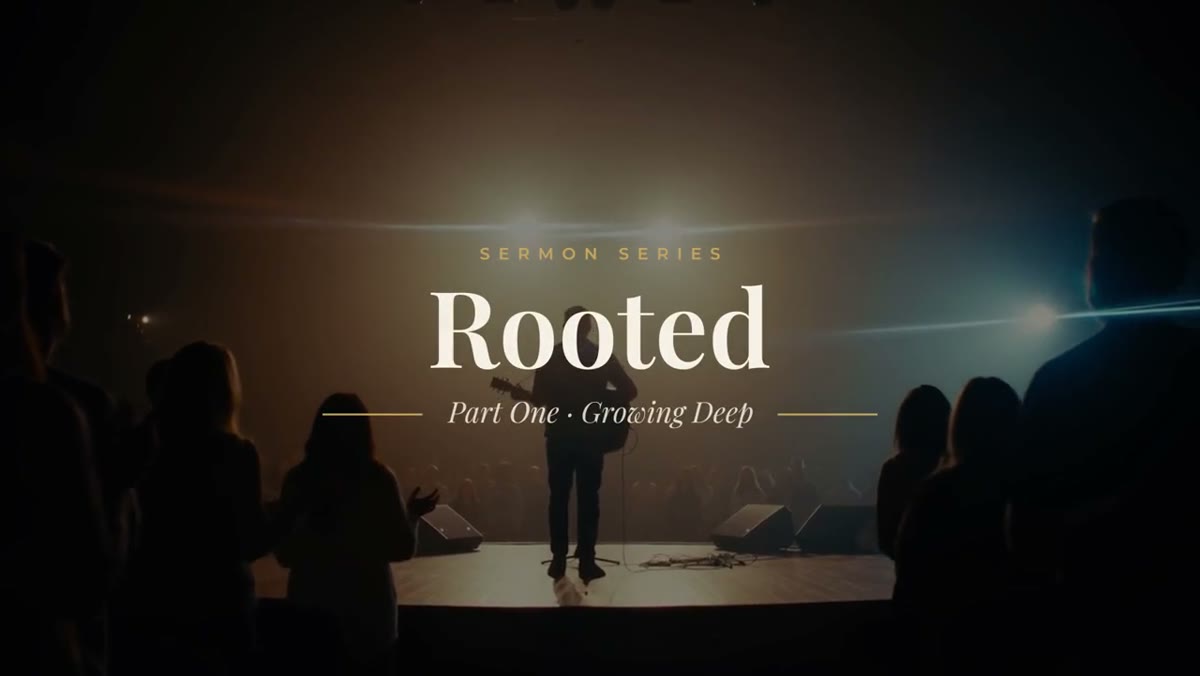
- Sermon Series Title: a small-caps label, a large serif title that rises in letter by letter, and gold rules around an italic subtitle. Open each message with it.
- Sermon Point: a big gold numeral, a small-caps label and the point in serif type beside it. The point wraps, so a full sentence fits.
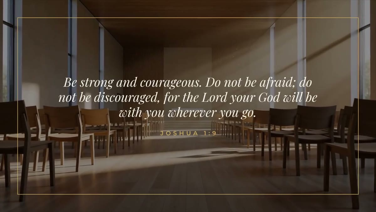
- Scripture Card: a gold frame draws on, the verse rises in word by word, then the reference follows.
- Key Verse Lower Third (free): the verse at the bottom of the screen, so it stays up while the pastor keeps preaching.
- Speaker Lower Third: a serif name, a gold rule and a small-caps role, for pastors and guest speakers.
All five share Playfair Display and Montserrat, both free and included in the download, so they read as one system rather than five graphics from five places.
Set the series look once, then reuse it
A series usually starts with still artwork for the slides, the website and social. Match the motion graphics to it once, at the start of the series:
- Drop the Sermon Series Title on a timeline and select it.
- In the Essential Graphics panel, use the eyedropper next to each color to sample the background, text and accent colors from your series artwork.
- Do the same on a Sermon Point, a Scripture Card and a Speaker Lower Third.
- Keep those styled clips in a sequence named after the series. Each week, copy them into the new message and change only the words.
Every copy keeps its own text and colors, so that sequence becomes the series kit. A volunteer who has never opened After Effects can put together next week's graphics in a few minutes.
Writing for the screen
What sounds right from the pulpit often runs long on screen.
- Series title: two to four words. Put the week in the label, such as WEEK 3 or PART 2 OF 5, and the message title in the subtitle.
- Sermon points: one line if you can, two at most. Show what people should write down, not the full paragraph the pastor says.
- Scripture: split long passages. The Scripture Card wraps longer verses, but two or three short cards read better than one crowded one. Add the translation to the reference, such as Romans 12:2 NIV, so people can find the same wording.
- Hold time: longer than you think. Give a sermon point at least five or six seconds, and a verse long enough to read twice at a relaxed pace.
Using them over service footage
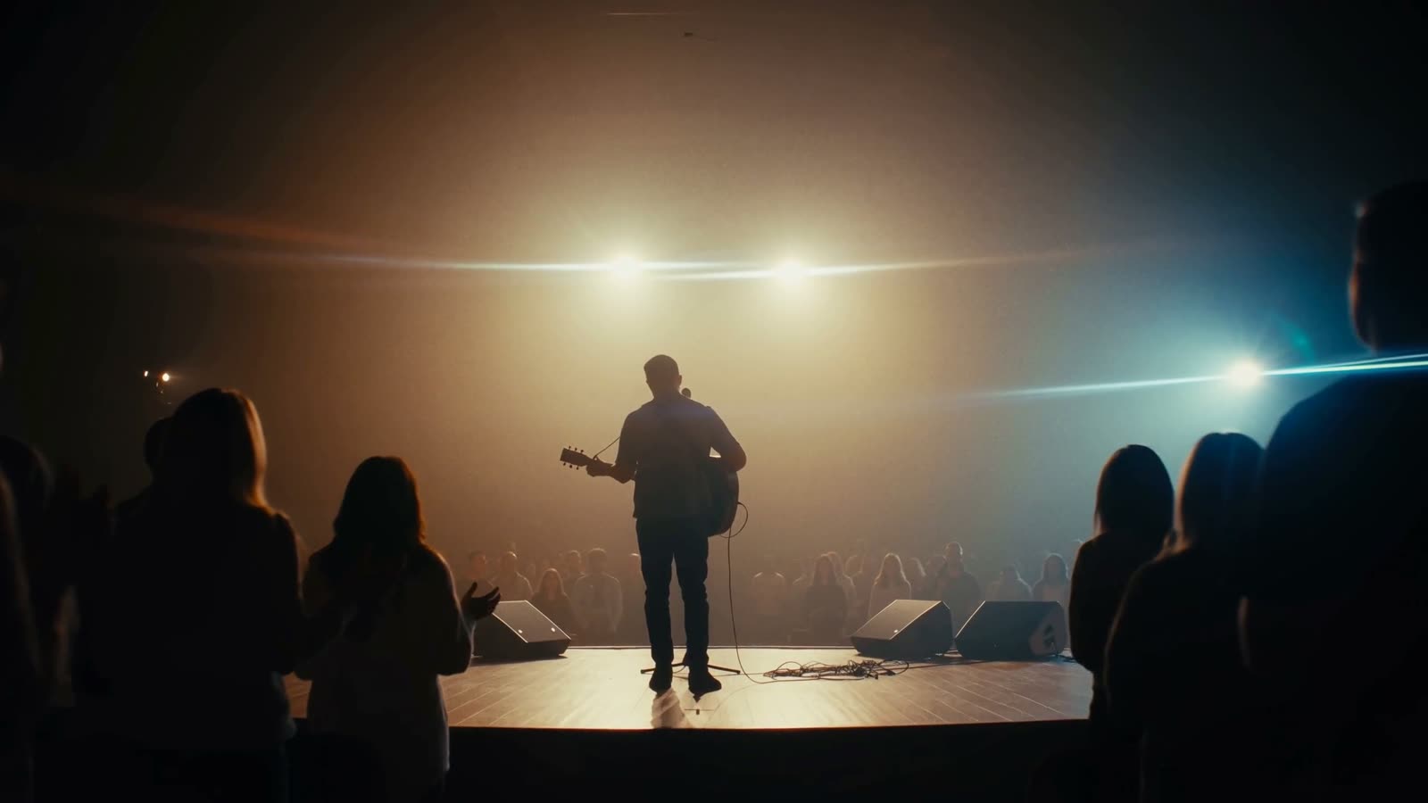
The Series Title and Scripture Card have a background you can switch off. With it off, the graphic sits over your stage shot, which keeps the pastor in frame while a verse is up. Sanctuary footage varies, so check a few things:
- Stage lighting often puts LED walls or a projection screen behind the speaker. Turn on the optional soft panel in the lower thirds whenever text lands on something bright.
- Keep text inside title safe, at least 5% in from each edge. Some people watch the archive on a TV, and TVs can crop the edges.
- If the pastor moves around, place the Key Verse Lower Third on the side of the frame with the most open space, or cut to a wider shot while it's up.
Every template animates in and out at any clip length. The in and out animations sit in protected regions, so trimming changes how long a graphic holds, not how fast it moves. That helps in a sermon edit, where you match each graphic to how long the pastor stays on a point.
Openers and social clips
For a bigger opener on the first week of a series, the Light Sweep Title from the Signature Pack reveals a serif title behind an anamorphic streak and warm light leak, and sits comfortably next to the church set. For social clips from the message, the Quote Card reveals a strong line word by word with an attribution.
The Church & Ministry Pack has all ten church templates for $39. The license covers every service, series and stream your church makes, including broadcast and monetized video.